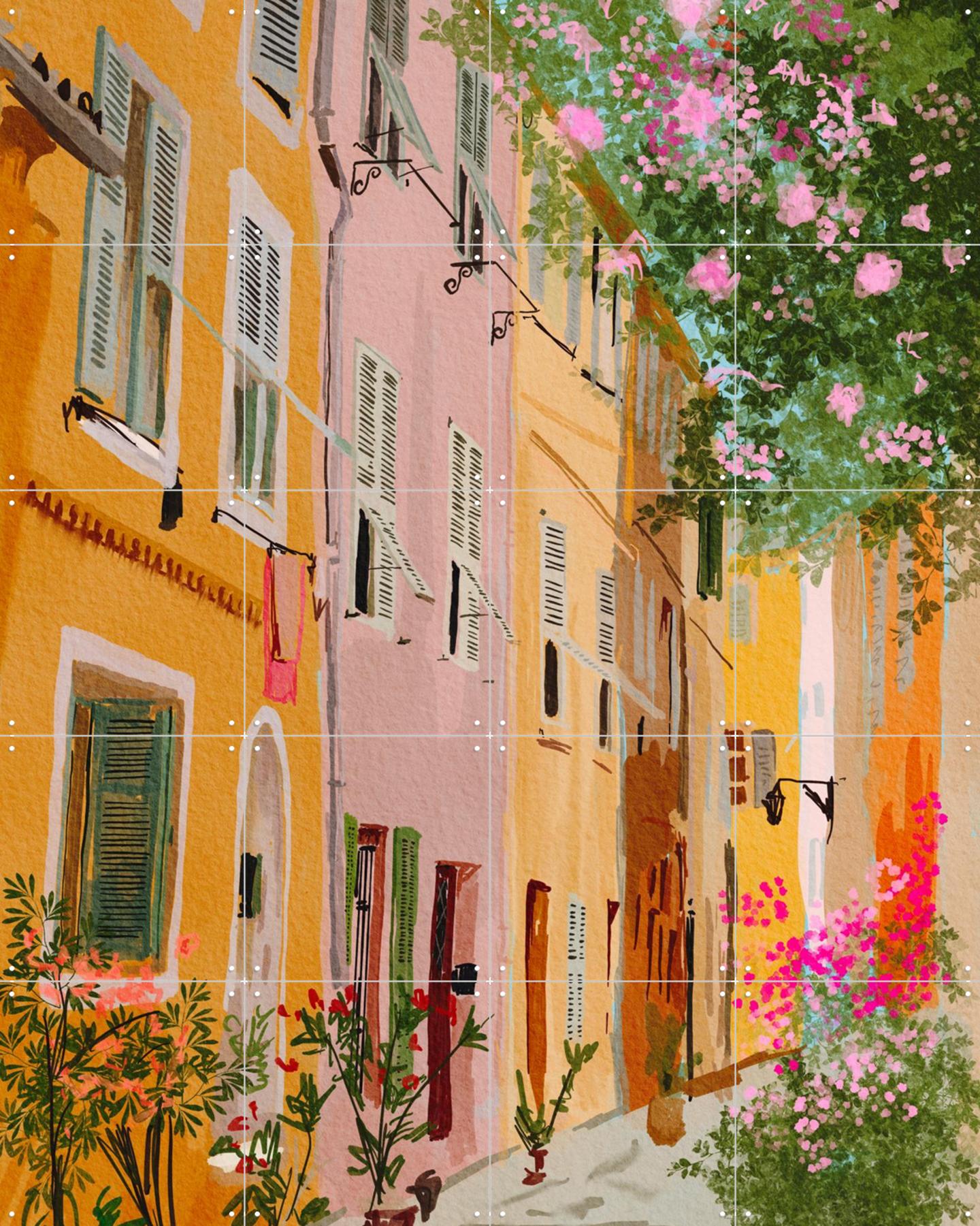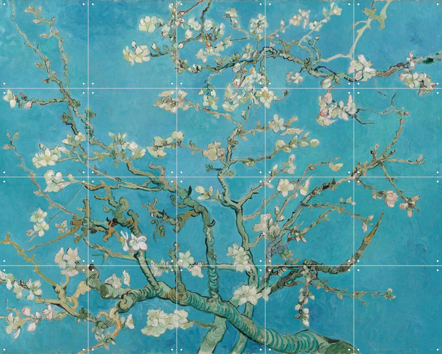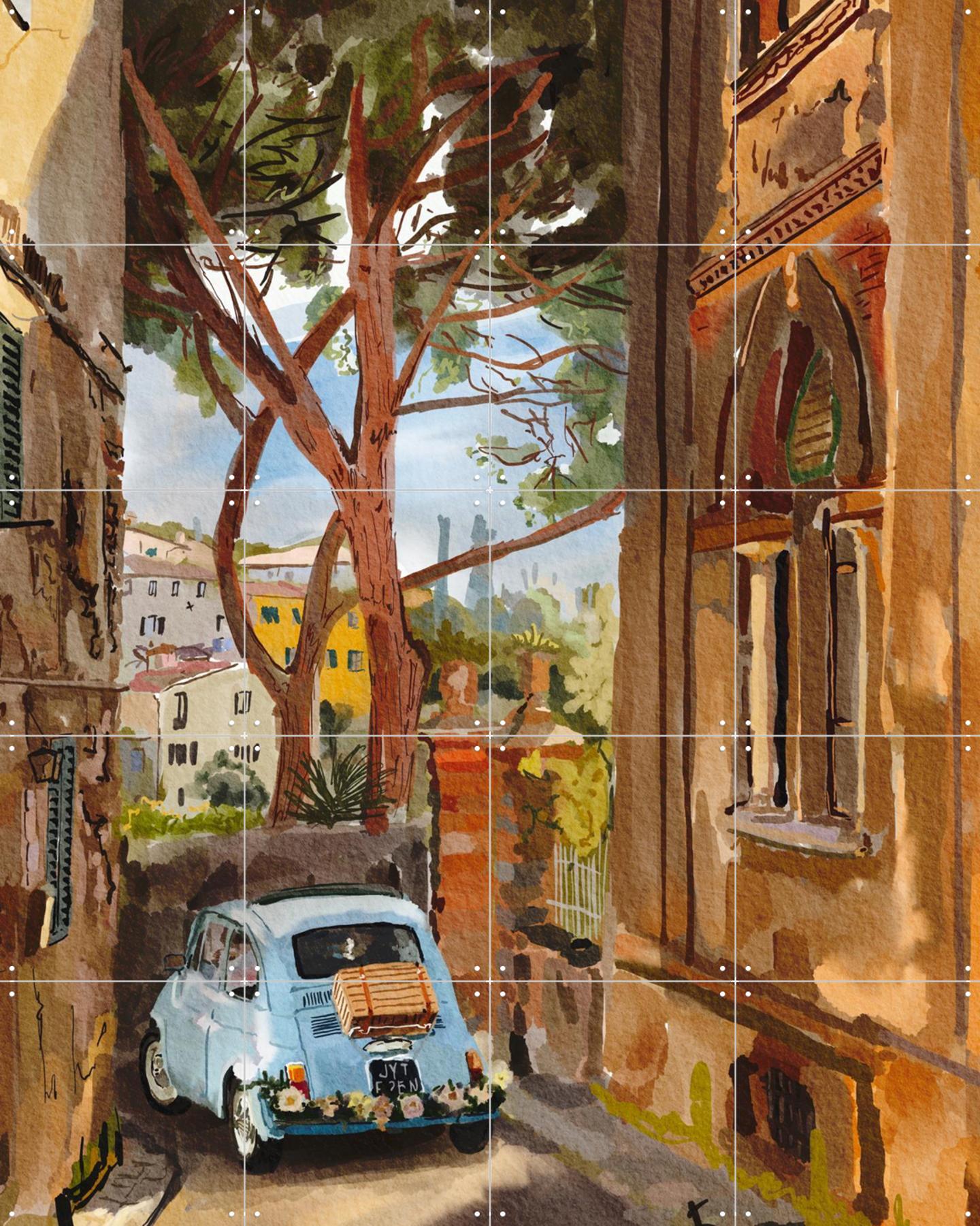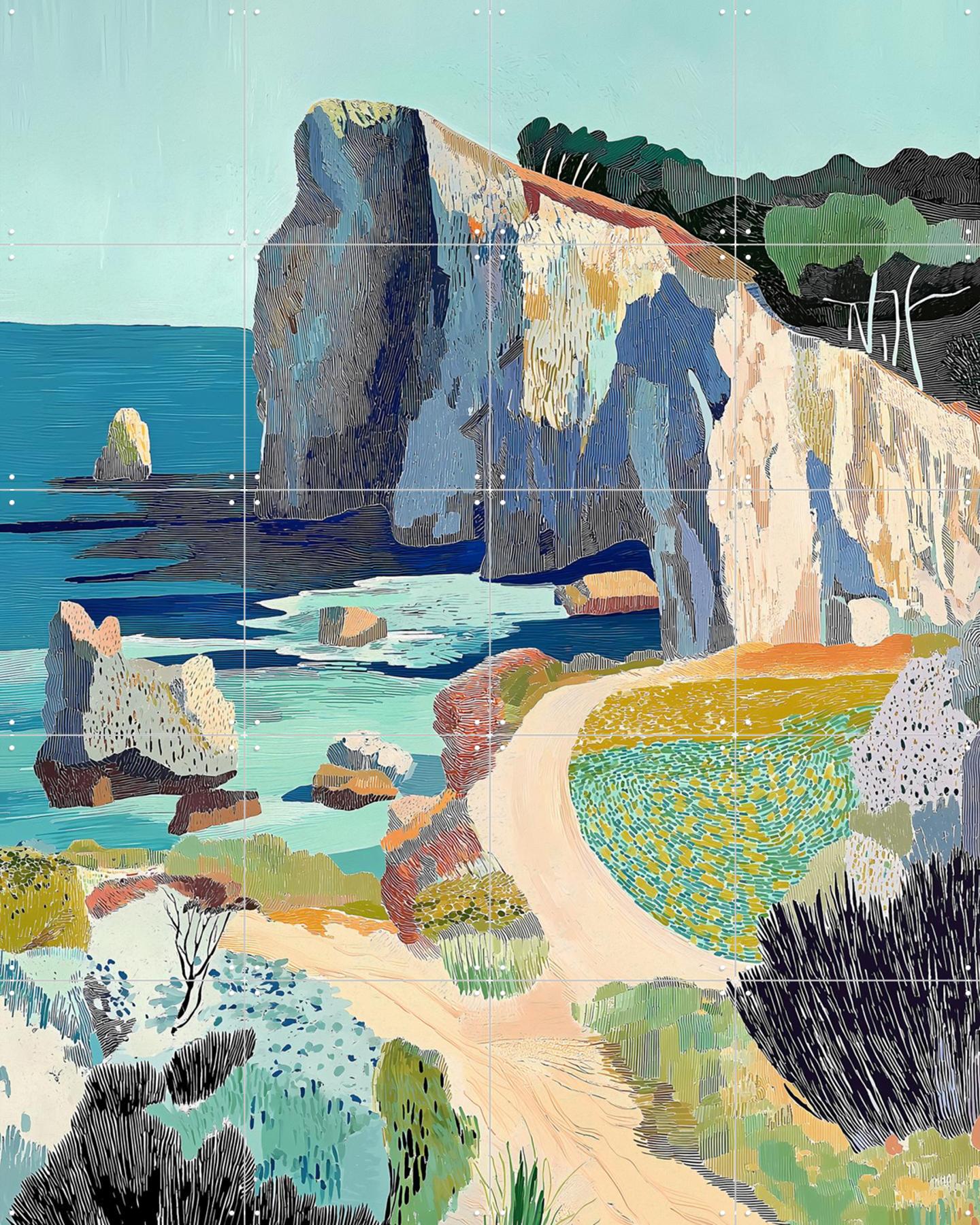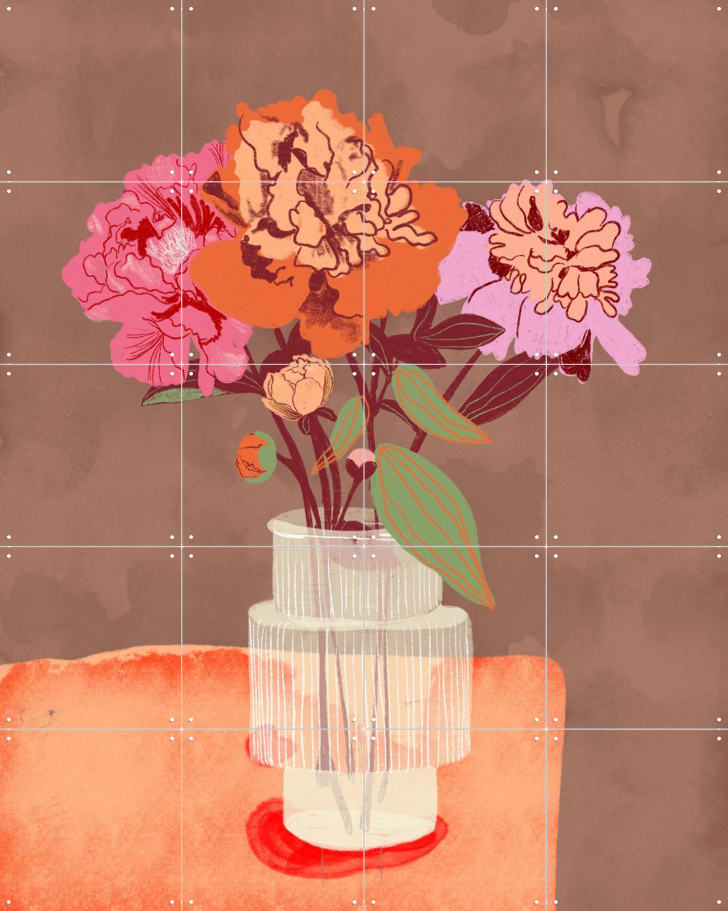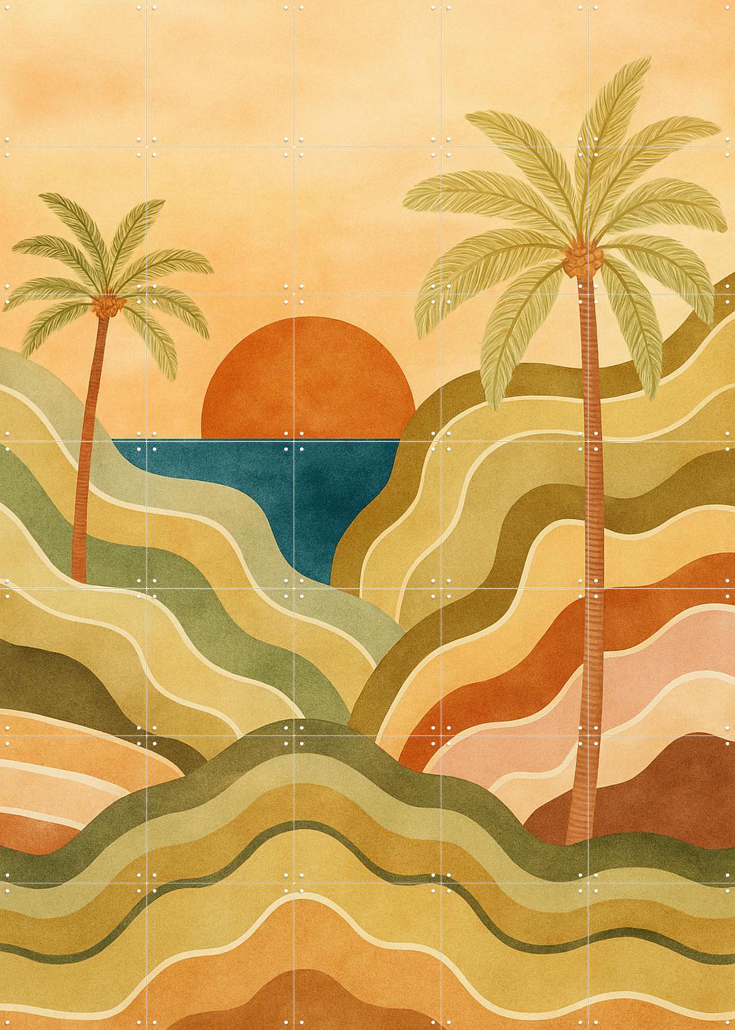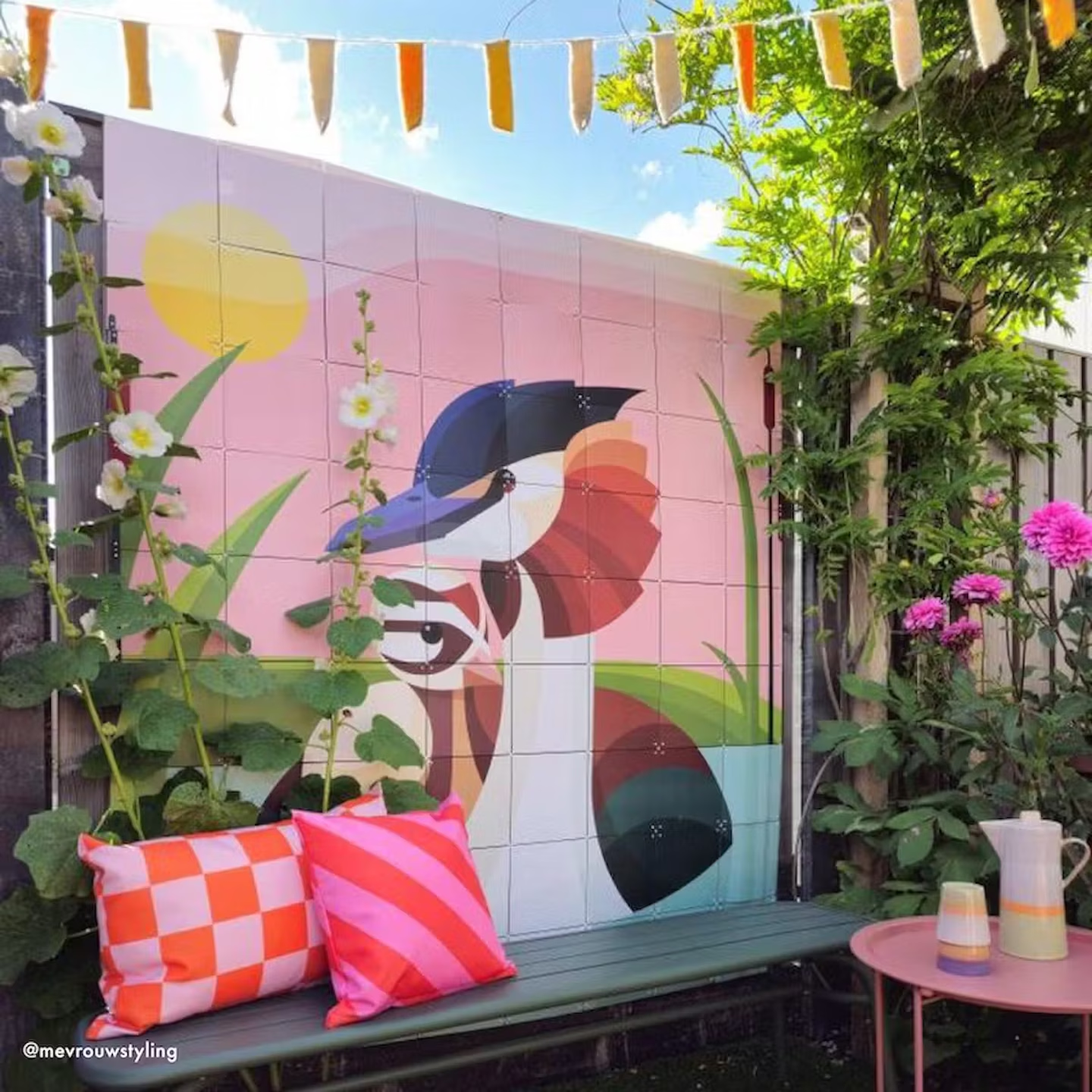
That makes choosing an image outdoors a different question than indoors. Three directions that hold up.
Going along with what already grows
The easiest and most predictable choice: botanical. Leaves, plants, shades of green. It strikes up a conversation with the garden rather than arguing with it.
It works best somewhere there is already something green, so the image extends the garden. With one pleasant side effect: this greenery needs no watering. Start with Botanical Greens.
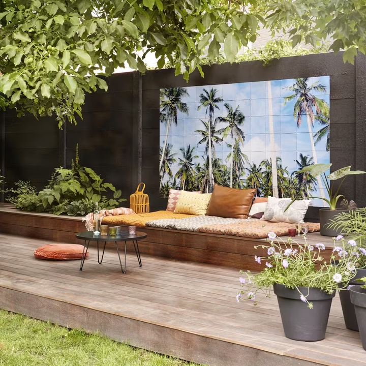
Or go the other way and contrast
The reverse route. A garden is green already; something that is not green stands out all the more for it. A graphic piece or one strong colour against a green backdrop does more than yet more foliage.
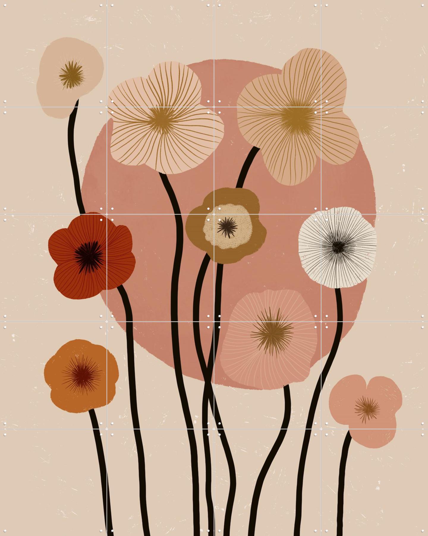
This works well on a balcony or a small terrace, where the wall makes up more of the view than the plants do. See Power of Color and Fields of Flowers.
Keeping it quiet when the garden is the star
If there is plenty to look at in the garden already — borders, furniture, a parasol — the wall does not have to join in. Light, muted tones and little detail keep the whole thing calm.
What works less well outdoors?
Two things, and both come down to distance:
- Small, fine detail — outdoors you look from further away, often from the other end of the garden. What is lovely at a metre and a half turns into a smudge at six.
- Images that live on subtle colour — outdoor light shifts from morning to evening and from season to season, so fine colour relationships never look the same twice.
Big and clear beats small and subtle, then — and size is no constraint, because it grows with the number of cards.
And the practical side?
Where to hang it, how to secure it against wind and what to do in winter is all in hanging an IXXI outdoors.
Why adaptable wall art
You click lightweight, tear-proof cards together with X-connectors and mount them without drilling. Size and design are yours to set. Outdoors that is doubly useful: come autumn it moves inside, and in spring it goes back up.