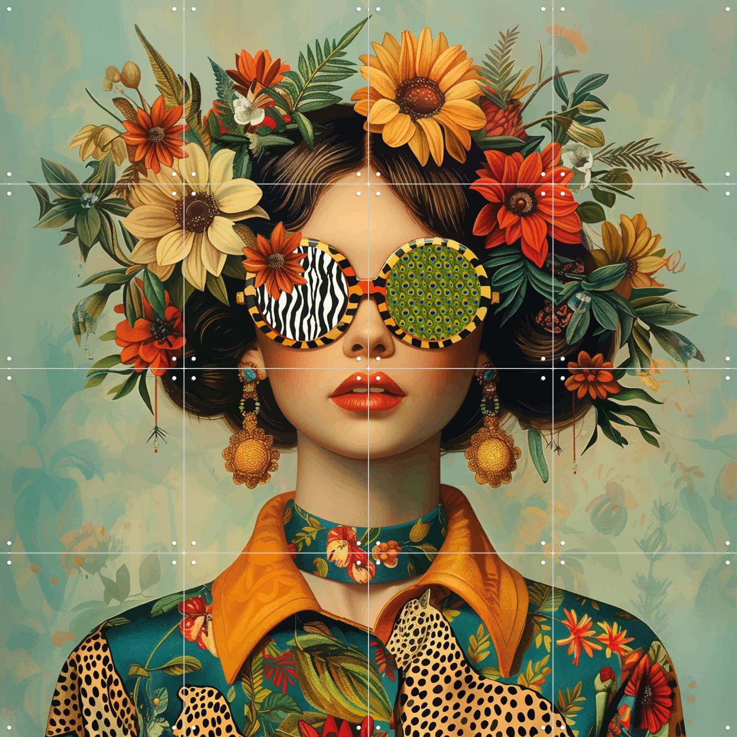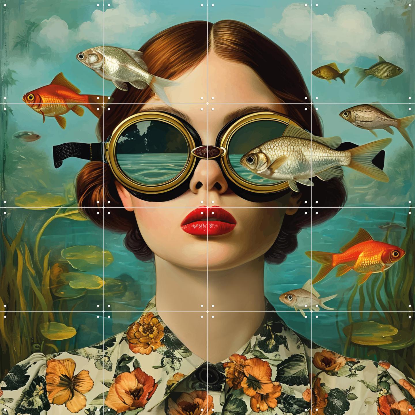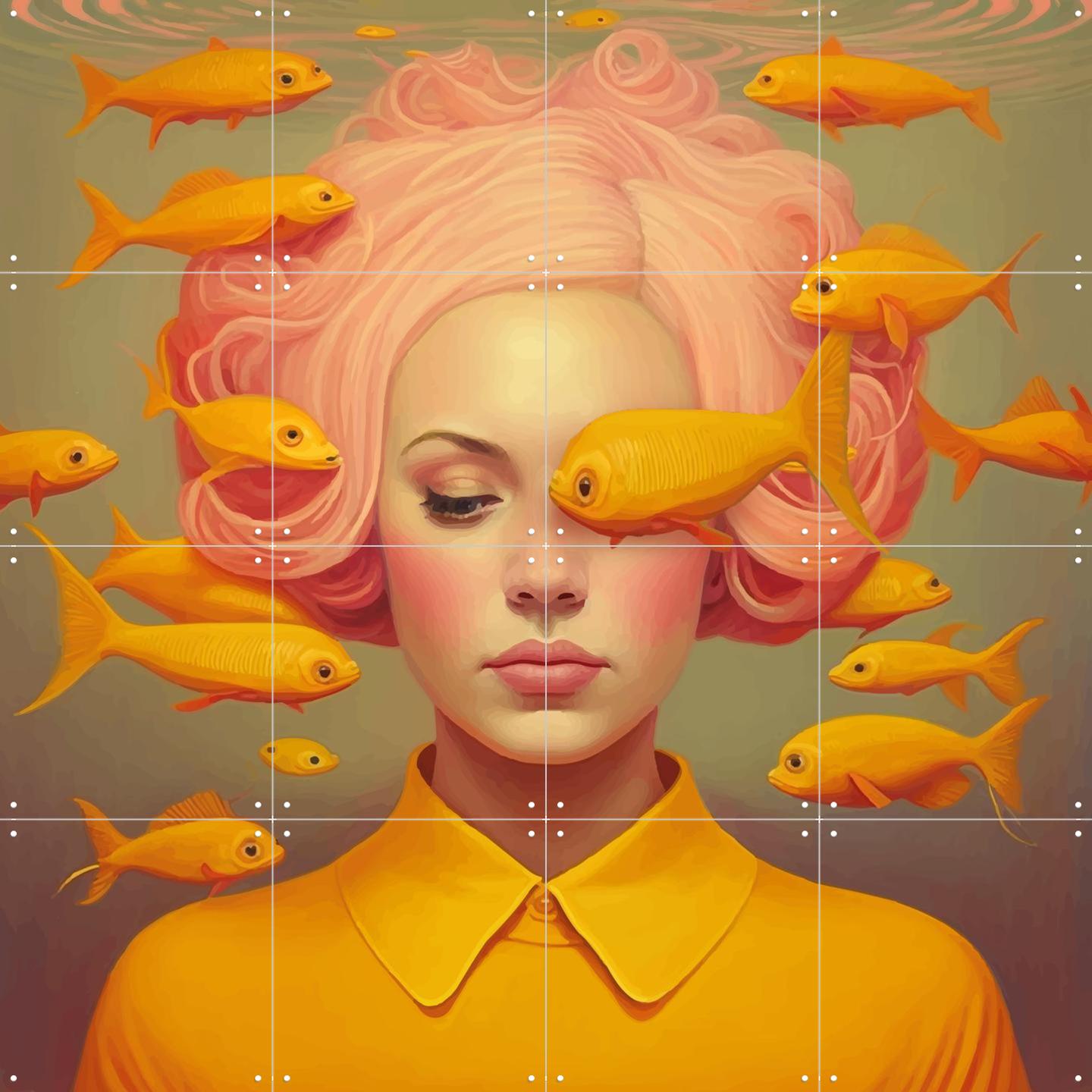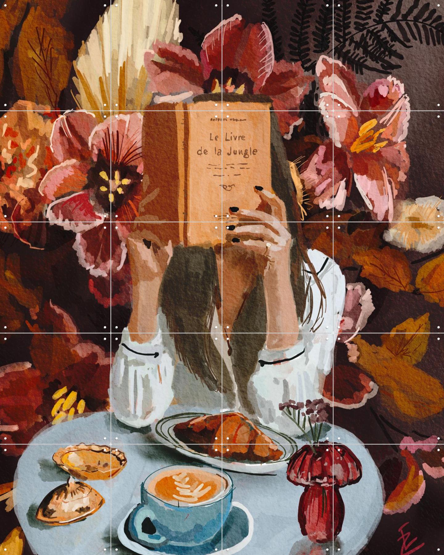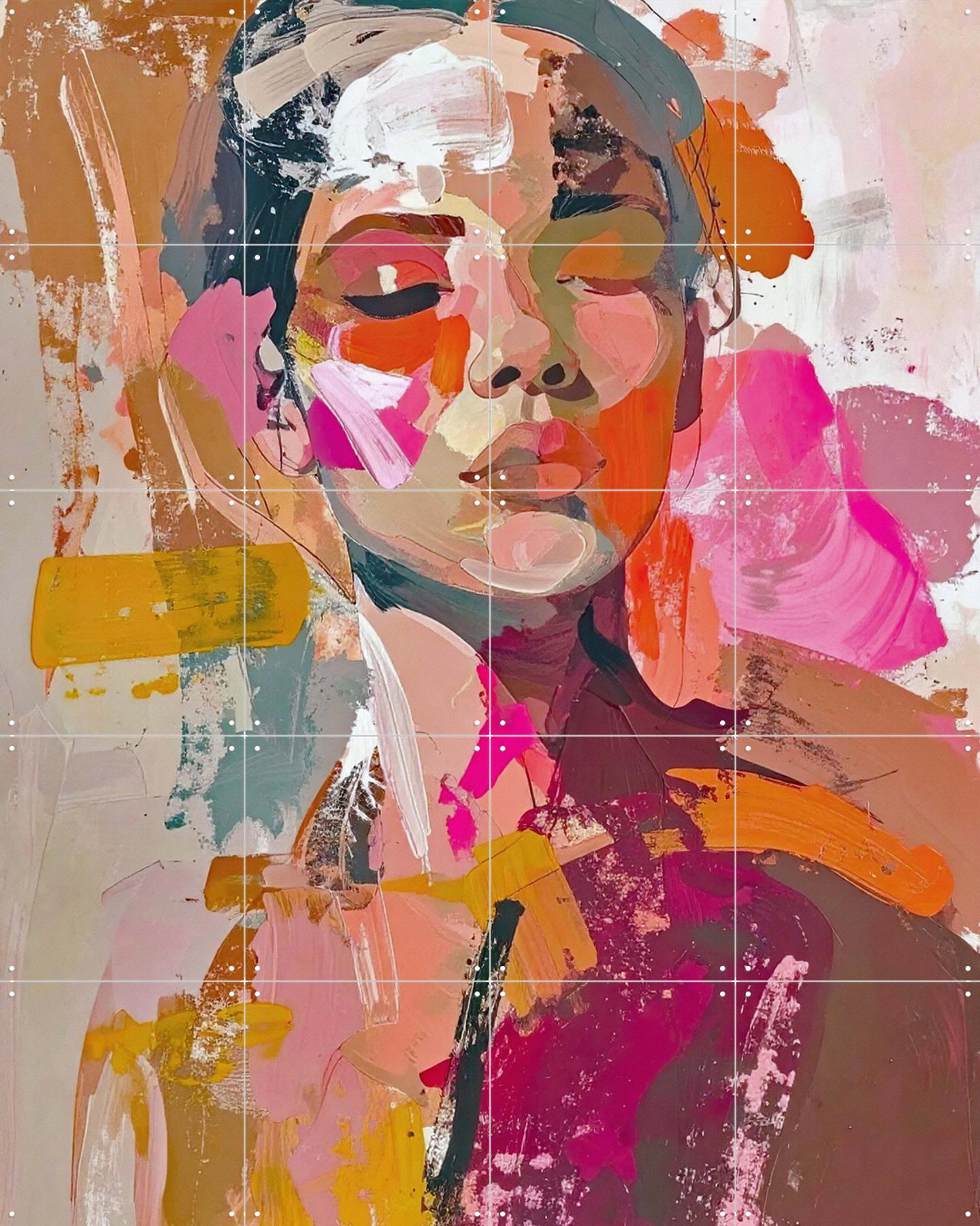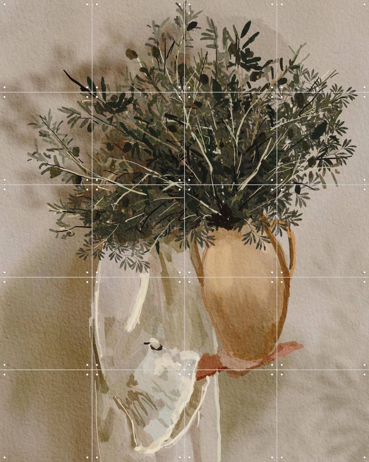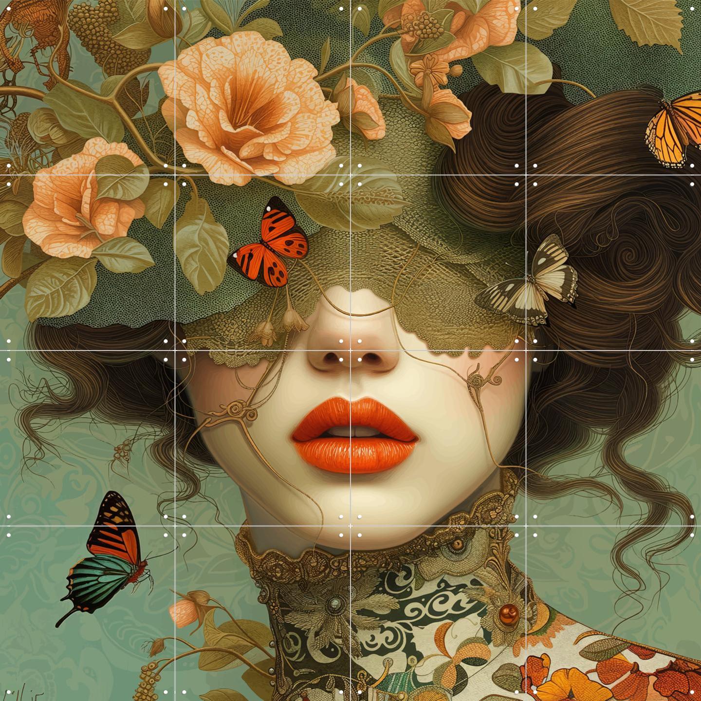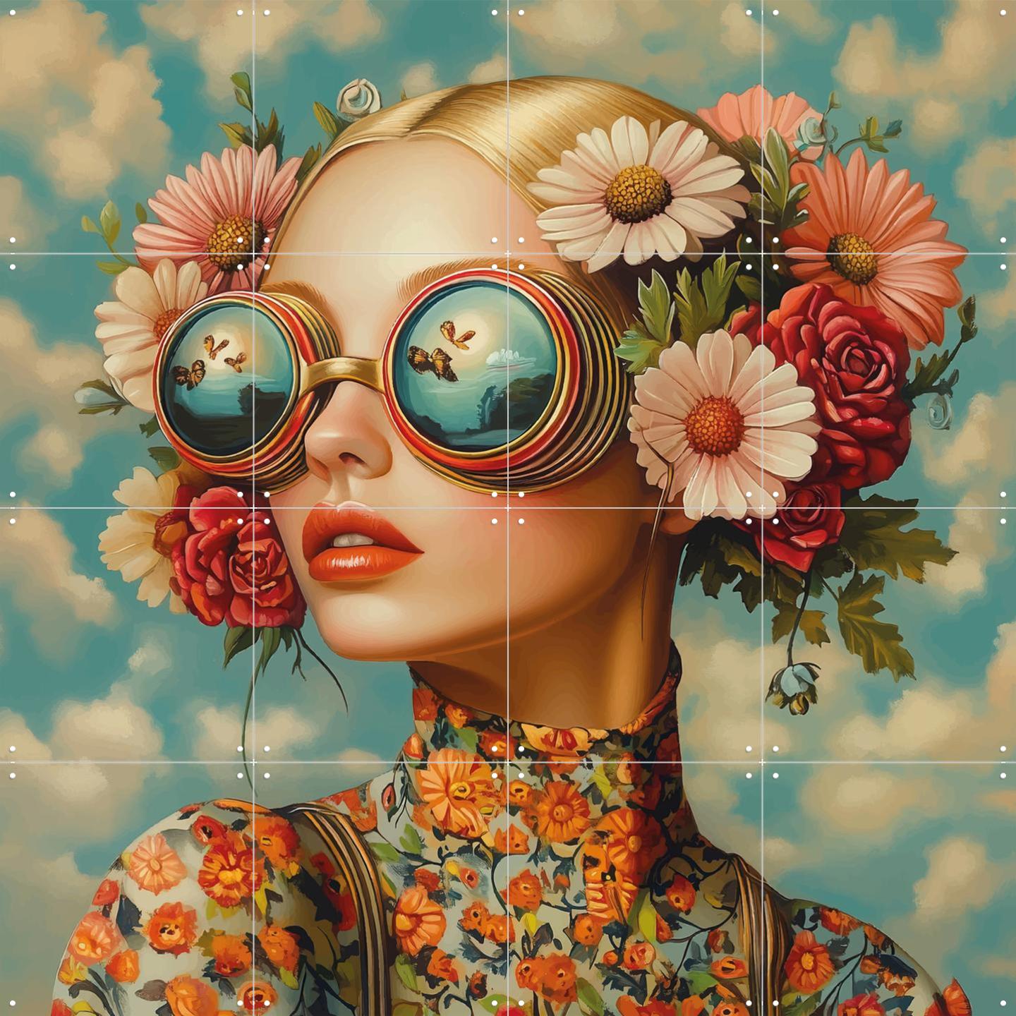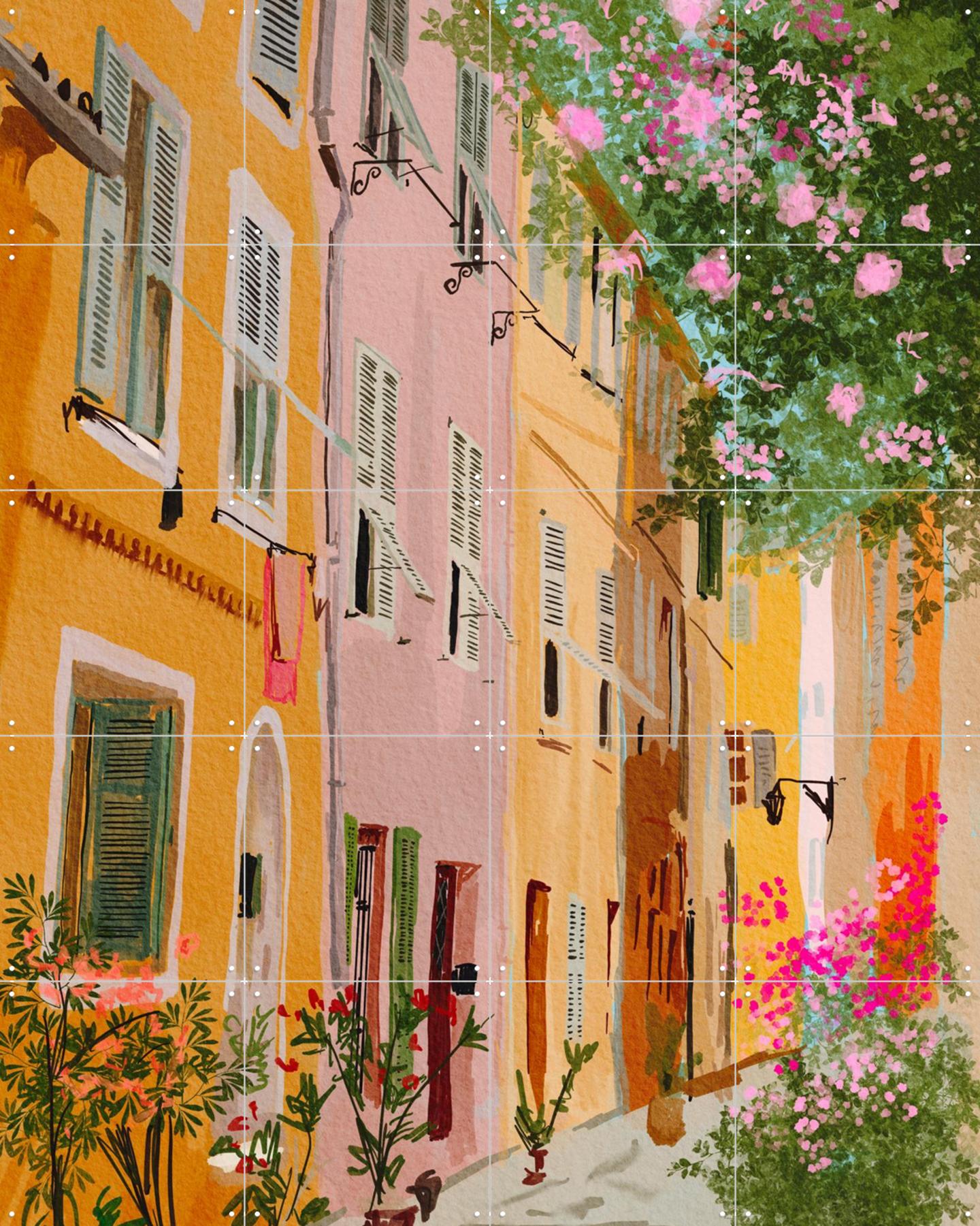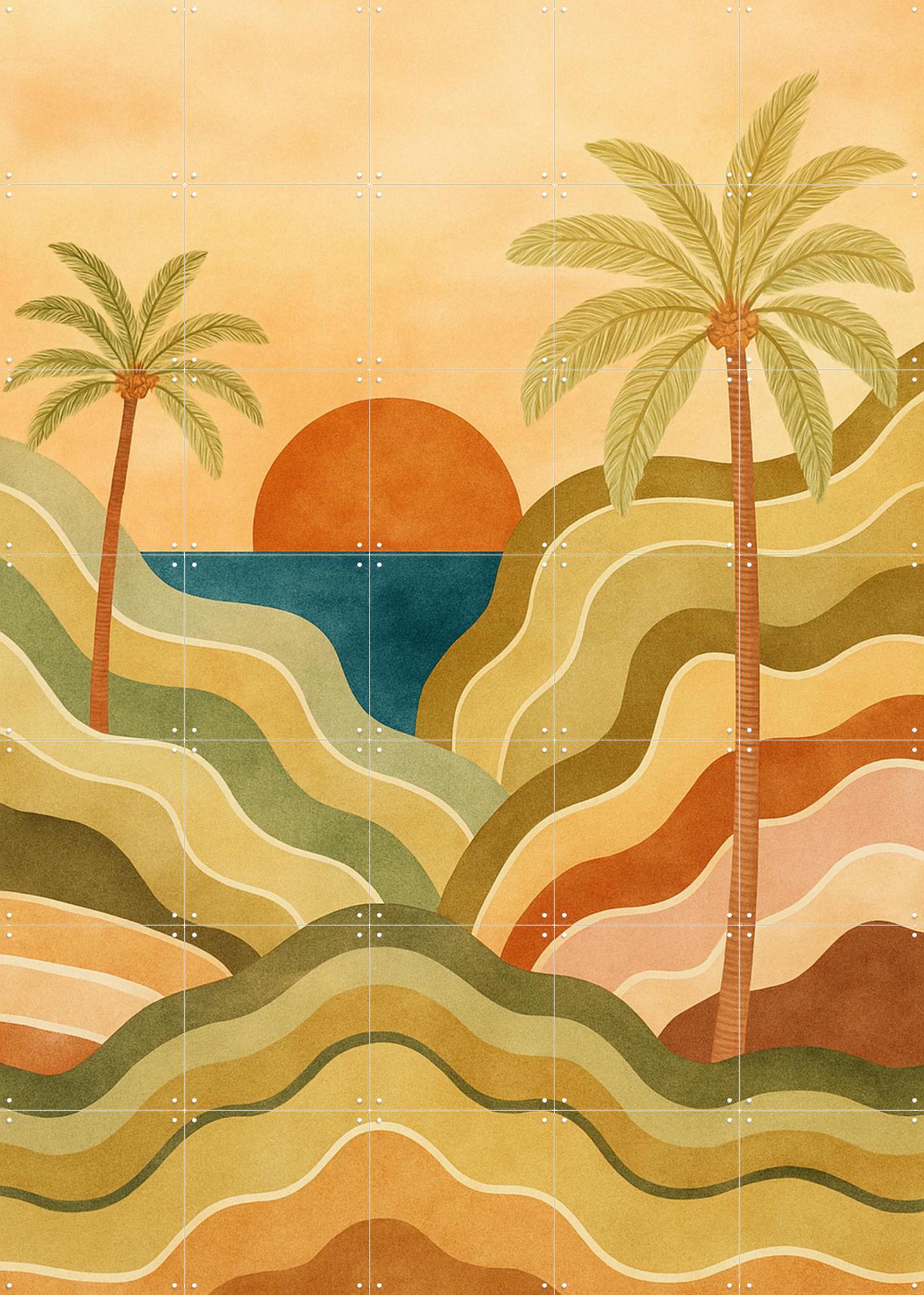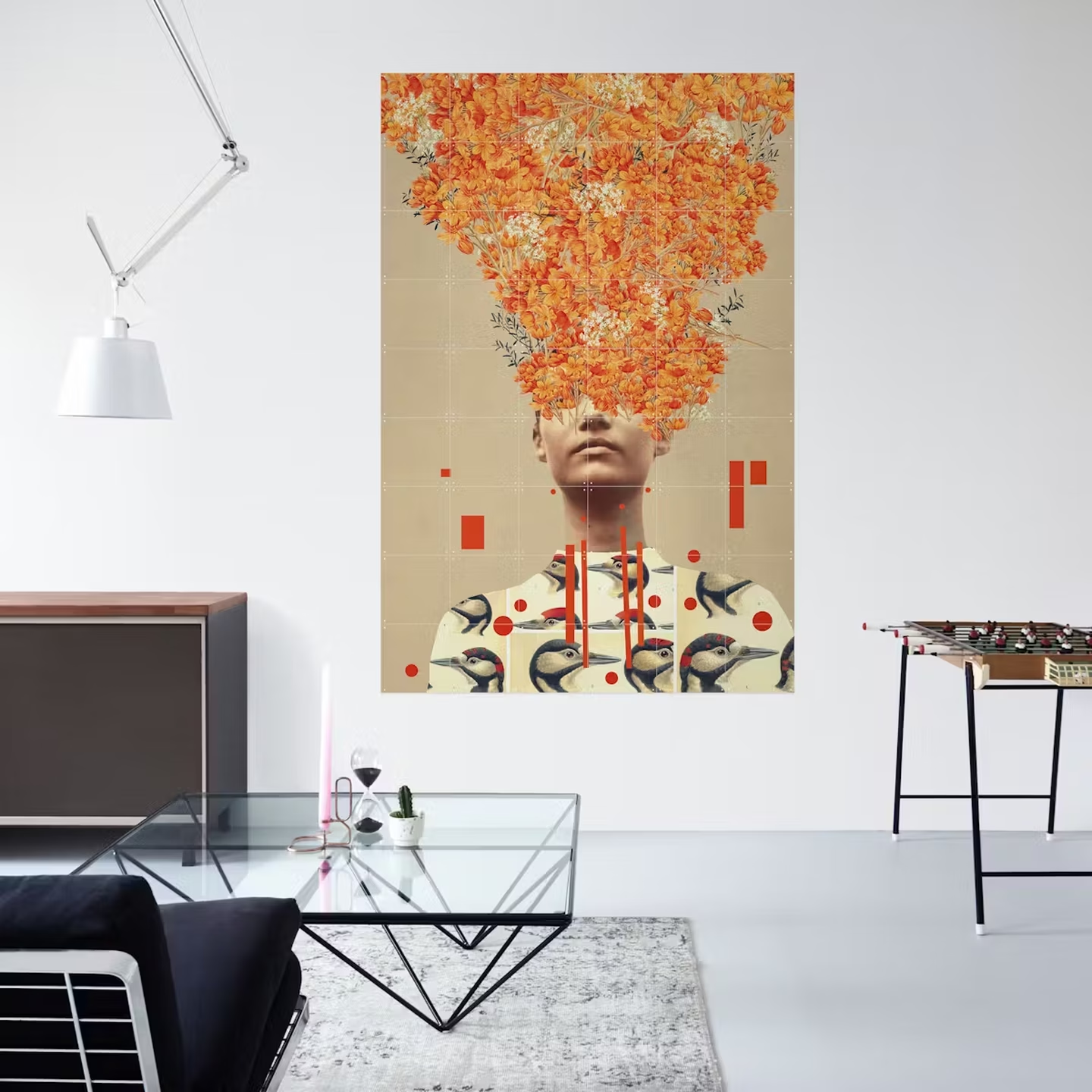
Where trend lists usually crown one winner, we see the opposite. People arranging a wall no longer pick a single style; they put things side by side that were never allowed to meet. That is better news than a prescription: nothing has to go for you to follow it.
Calm and natural
Light materials, soft tones, and shapes that are clean without turning severe. There is usually one playful detail in it — a leaf that breaks the line, a patch of colour that does not belong. That exception is what makes it.
On a wall this works with botanical pieces and with graphic work that lives on shape rather than colour: Botanical Greens and Minimalist Art.
Graphic and structured
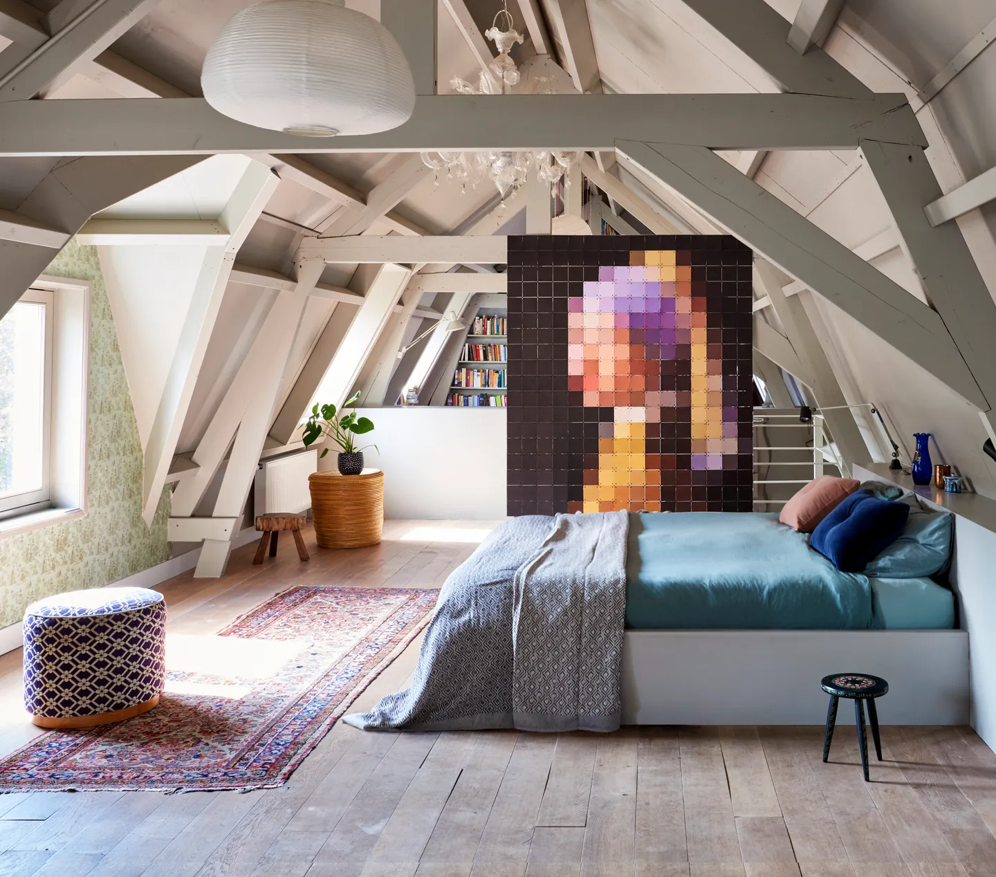
Held-back colour, clear lines, repetition. Think of the kind of division you see in architecture sooner than in decoration: grids, blocks, a pattern that carries through consistently.
This is the direction in which the grid of an IXXI is already decoration in itself. Geometry and abstraction belong here: Abstract and Pixels.
Daring to collect
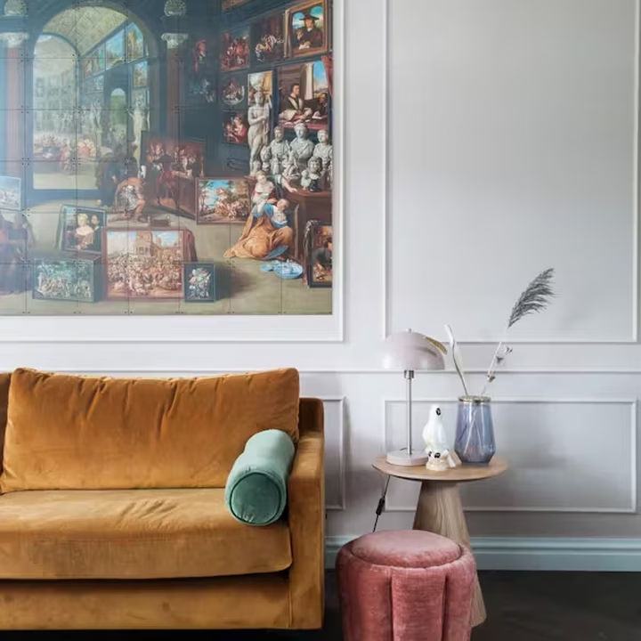
The counterweight to the two above. A wall as a collection rather than a composition: something old beside something new, a bright colour beside a classic, something wilful in between because it reminds you of someone.
This one takes the most nerve and gives the most personal wall: Pop Culture and Power of Color.
So how do you choose?
You do not, is the honest answer. Pick the direction that suits how calm the room is, and take one element from one of the other two. A clean botanical grid with a single collected piece beside it does more than three directions competing for attention.
Why adaptable wall art
You click lightweight, tear-proof cards together with X-connectors and mount them without drilling. Size and design are yours to set. In a year where directions sit side by side that comes in handy: combining three styles is less of a gamble when you can swap them later.